Companies are releasing their “Colors of the Year” and we’re seeing some neutral, more somber colors being selected. Part reflection of the times we are in, a desire to be closer to nature or to get grounded? This month we’re showing you some of our favorite interiors that feature shades of brown, what the color signifies and how it affects us. Let’s dive in!
2021 COLORS OF THE YEAR
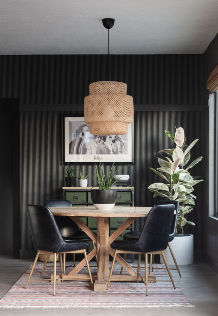
The Sherwin Williams color of the year for 2021 is called Urbane Bronze – and it’s a serious, deep brown reminiscent of a heavy metal. We love the idea of painting a focal wall in this color as it’s not only bold, but very grounding. It pairs well with light neutrals – and soft, textured furniture and accessories in ivory compliment it especially well.
PPG released a trio of colors – a beige called Transcend, an earthy coral called Big Cypress and a cool blue dubbed Misty Aqua. Each has ties to biophilic elements and all are in the ‘pastel’, calming color arena.
Behr introduced a pallet similar to PPG’s – with warm neutral tones and cool light blues, evoking images of sunsets and calm beaches. We especially love Canyon Dusk, which is a muted orangey-blush.
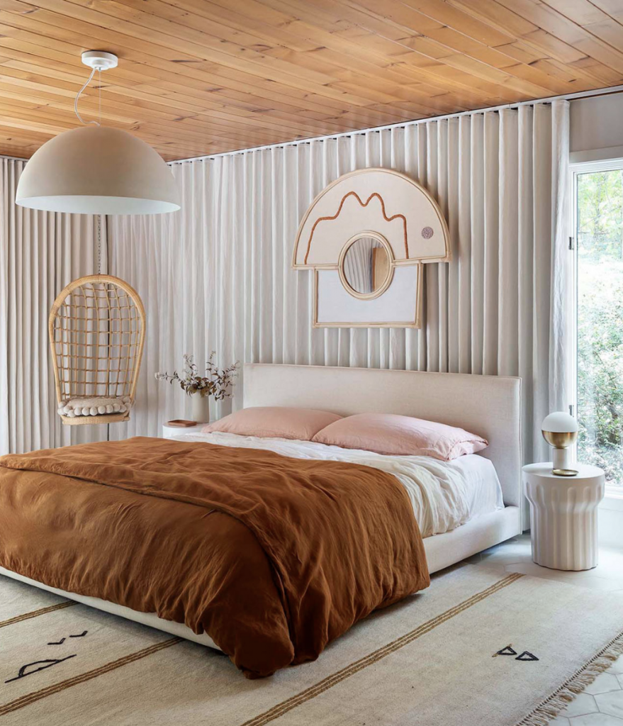
All of these pallets are centered around neutrals, specifically brown, which we see as the overarching theme. Using these colors is a way to bring nature into our homes and foster our connection to the Earth – which is especially important as we’ve all been spending so much time indoors.
BROWN + HOLISTIC DESIGN
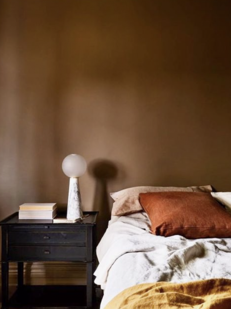
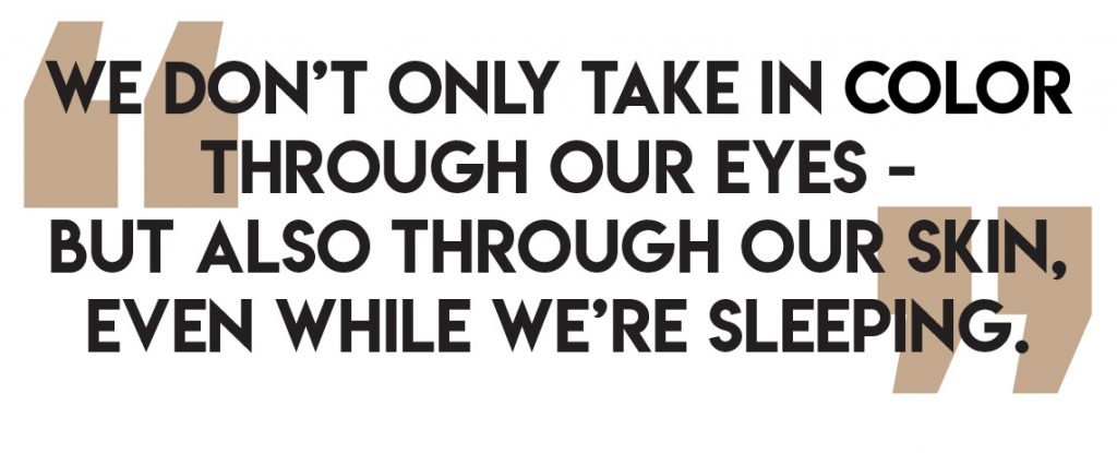
Each color affects us in a different way. Brighter colors like reds and yellows are more uplifting and energetic while softer colors can be more calming and soothing. And darker colors, like brown, make us go inwards and be more somber and introspective. Brown also reminds us of nature and is a great way to bring nature in and is also a very grounding color. Because colors affect us in different ways, you can think about the function of a room and paint it a color that will be supportive of that particular function and it’s a great and easy way to create a more supportive space.
WE COULD TALK COLOR ALL DAY…
We spoke to Forbes about Sherwin Williams’ Color of the Year for 2021, what it means and how to use it in your space. Click here to read the full article.
Gala Magriñá Design works with clients that understand the importance of creating a beautiful space and want to work with a no-nonsense design team that is able to clearly chart the best way forward. What separates or approach from other designers is our extensive knowledge of how people live and how best to create a customized space that nurtures that. We aim to merge cool and beautiful interiors with a holistic, mindful and intuitive approach to design that results in powerful, healthy spaces that elevate and transform people’s lives. For more information please visit www.galamagrinadesign.com.